ANNA SAWLE
“my REbrand should reflect my skill and creativity as an award-winning florist.”
THE BRIEF
When Anna and I first discussed designing her a new logo, I could immediately see that her overall brand identity needed some rethinking first.
Anna knew that her existing logo no longer reflected her level of skill and creativity as an experienced, award-winning florist.
It was time for a change, and I had the opportunity to make Anna’s brand as authentic and as opulent as the wedding bouquets she created.
Anna’s old logo
CHANGING NAME
No one wants to change their company name once a business is already established. Yet ‘Wedding Flowers in Cornwall’ felt like a search term. I suggested that Anna rename her business as her own name, and keep ‘Wedding Flowers in Cornwall’ as the supporting tagline. She was understandably nervous in doing so, but after some consideration, she agreed it was a great way to elevate her brand.
UNIQUE SELLING POINTS
When I learned more about Anna’s business, it became apparent that she wasn’t fully leveraging the unique qualities that set her apart from her competitors.
She has a dedicated team that source local flowers to create exquisite bouquets. The flowers are often home-grown, collected from Anna’s farm situated near the historic ‘Wheal Coates’ engine house on St.Agnes Beacon.
I knew we had to incorporate this into both the brand language and the visual identity.
Wheal Coates engine house
Mission Statement
Before I started designing a logo, I suggested we work on Anna’s mission statement and the core values of her business. She worked with a copywriter to define the key statements she wanted to use across her marketing materials.
VISUAL development
After I’d researched competitors and created moodboards, Anna set her heart on an illustrative style. We decided to use the local landscape, flora, fauna and animals that could be found on her farm. I suggested illustrating a set of drawings that could be used to create a range of assets - website header, packaging, business cards, packaging, brochure, stickers, letterhead, social posts …
I set about sketching some ideas.
FINAL ASSET DEVELOPMENT
After some rounds of revisions I developed a suite of illustrative assets.
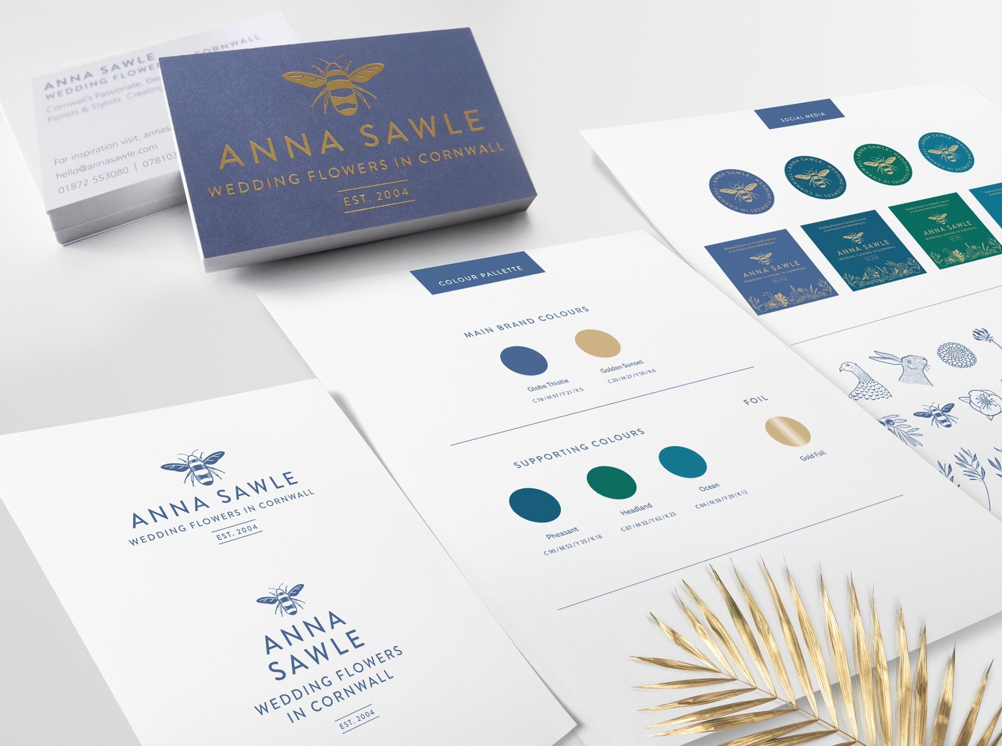
A sans serif font was chosen and logo variations were created. The bee was chosen for the main icon.
The suite of illustrations were combined to make graphics for signage, packaging and website.
Anna used these elements to brand her vehicle with gold ink decal.
photo: courtesy of Anna Sawle
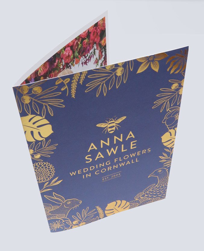
Anna and I worked together to create her brochure and business cards, adding a debossed gold foil for a luxury feel.
We spoke to photographers and obtained permission from couples who had photos of Anna’s flowers at their wedding. This showcased Anna’s talent and further enhanced her brand.
BRAND GUIDELINES
Once the core elements of Anna's brand were finalized, I developed comprehensive brand guidelines that outlined the usage of fonts, logo, and color palette. These guidelines also provided direction on how the illustrative elements could be applied across web and social media platforms.
For the brand’s primary color, we selected a rich, sumptuous purple, complemented by secondary colors in deep greens, blues, and golds, which together created a sophisticated and cohesive visual identity.
THE OUTCOME
I thoroughly enjoyed the process of developing this new brand identity for Anna. The final result successfully captures her reputation as one of Cornwall’s most prestigious wedding florists, and she is delighted with the outcome.
”I receive many compliments on my rebrand - it’s been noticed within the wedding industry and by my clients. It gives me confidence in charging my worth for my services. I feel proud to show it off!”
-Anna Sawle
All photos, illustrations & graphics shown on this page are copyrighted to Anna Sawle and Heather Allen & must not be reproduced or shared without their permission.


